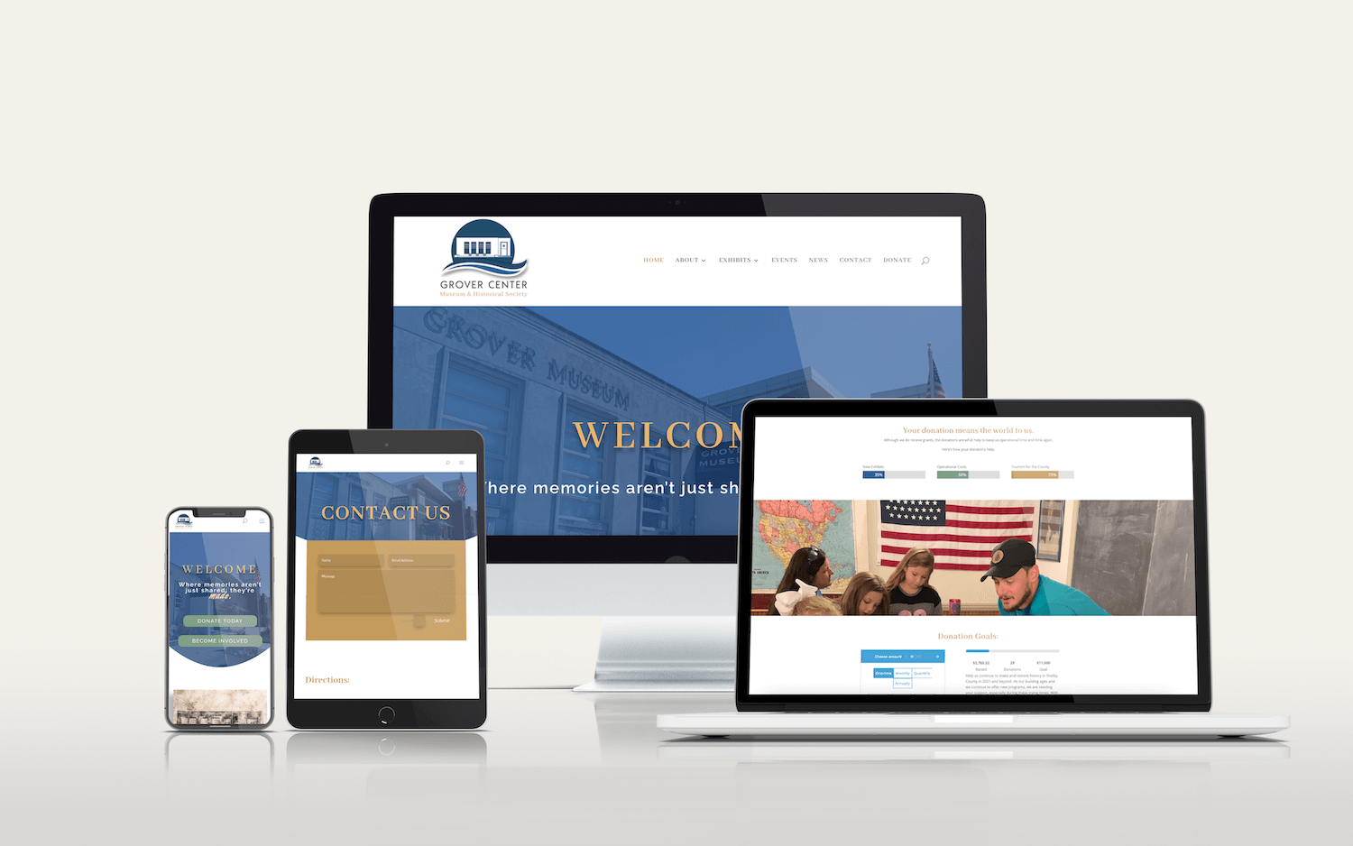
Branding + Web Design
Grover Center
The Brief:
Grover Center Museum & Historical Society contained unlimited resources of their area’s rich history but struggled to attract new audiences. They also operated as two separate entities, making promoting events and fundraising difficult, which is especially important for their 501-c3 status. I was hired on to do a full rebrand and website overhaul that would modernize their organization, reduce confusion, and promote their updated mission.
Scope of work:
- Full rebrand with new logo suite & updated messaging
- Marketing strategy
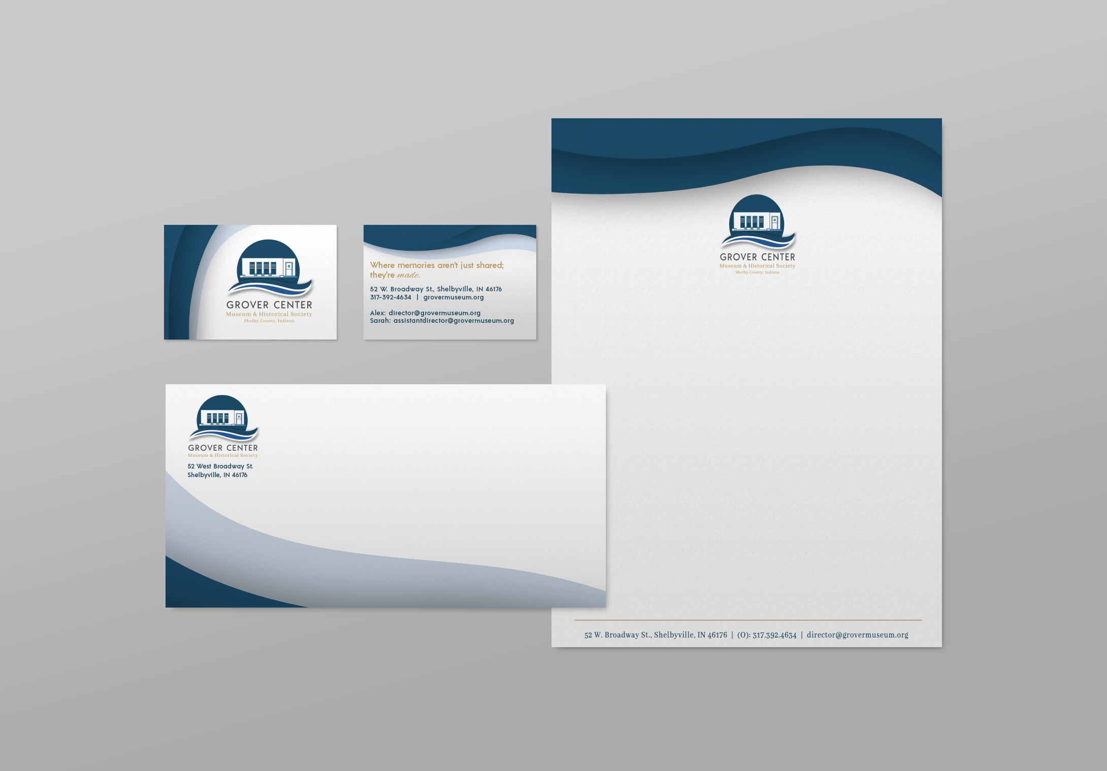
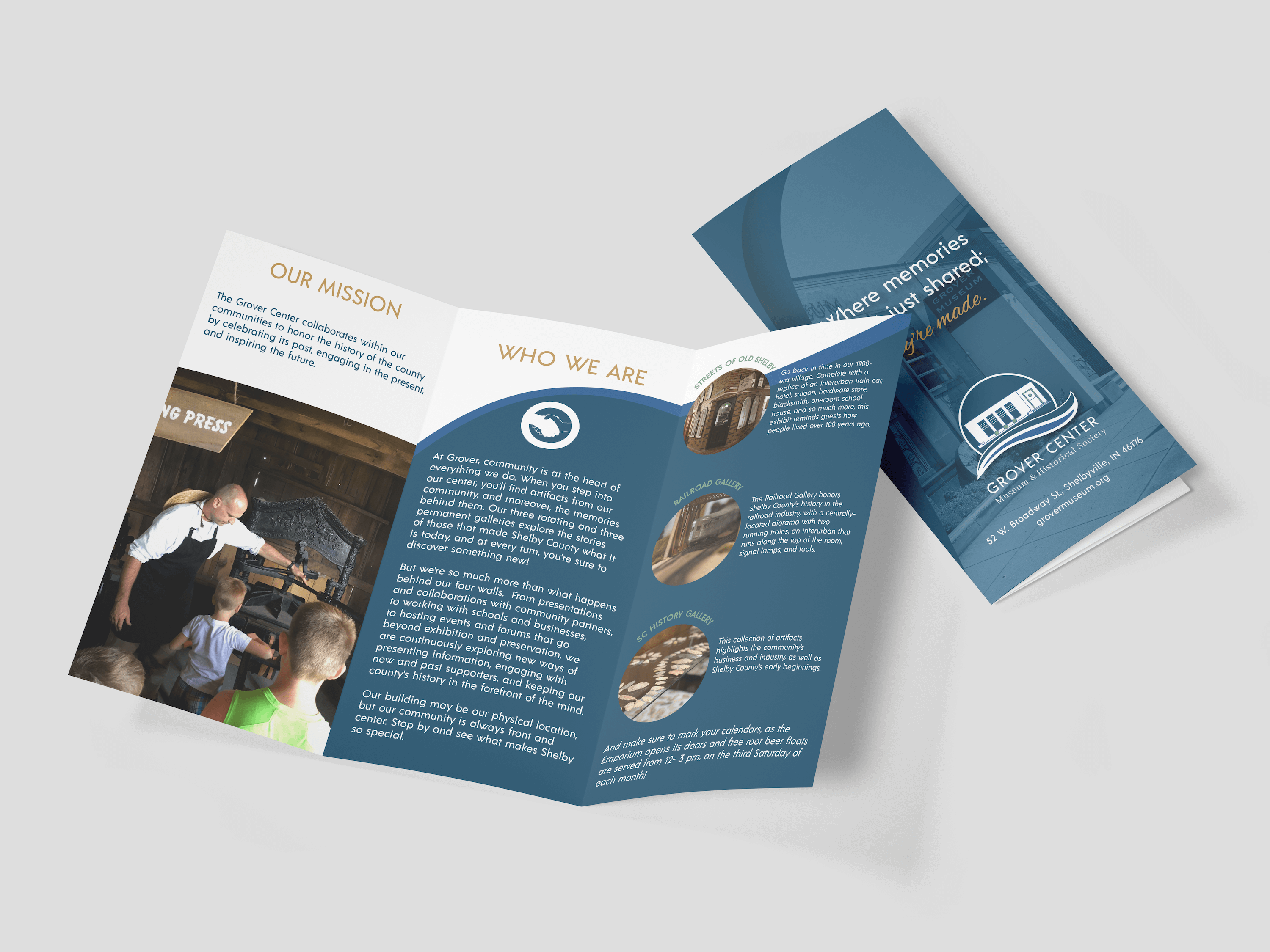
- Updated marketing collateral
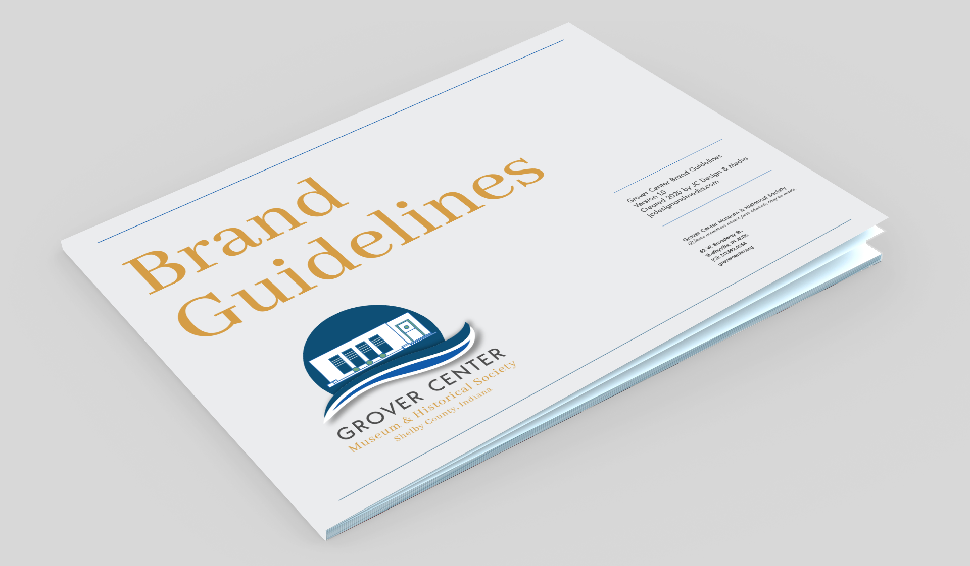
- Brand manual
- User-friendly website with integrated online donation system
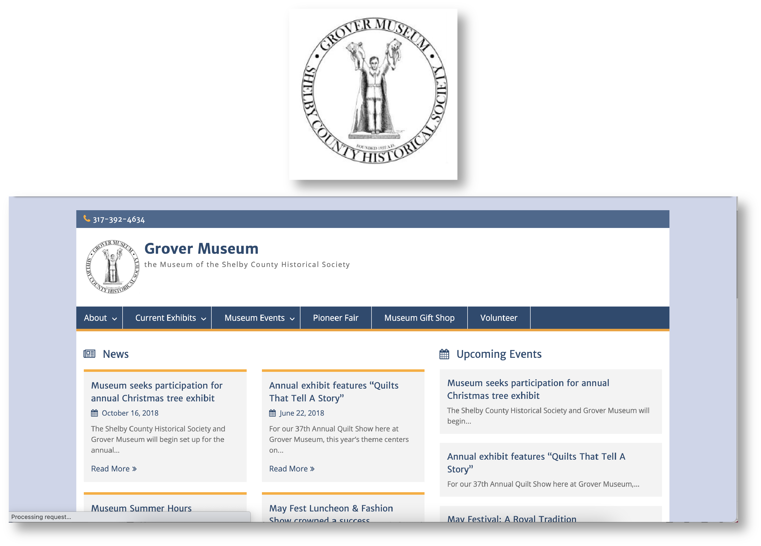
Before
Previously known as the Grover Museum, which was part of the Shelby County Historical Society, the website served primarily as a news source for the organization. While important, they also wanted their website to attract volunteers, be more engaging, and have an effective way to collect online donations.
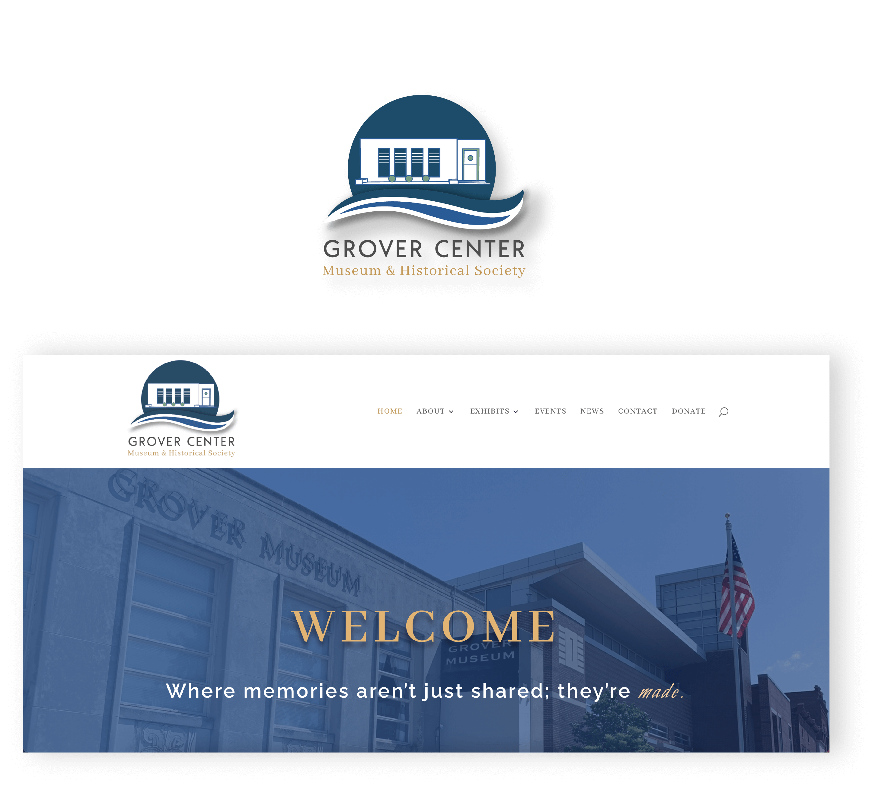
After
Providing the executives will full access to the site, the rebrand was put front and center starting with the new tagline. An area showcasing the latest exhibits was also included as well as refining the site’s overall structure. Following the launch, event attendance and online donations immediately improved.
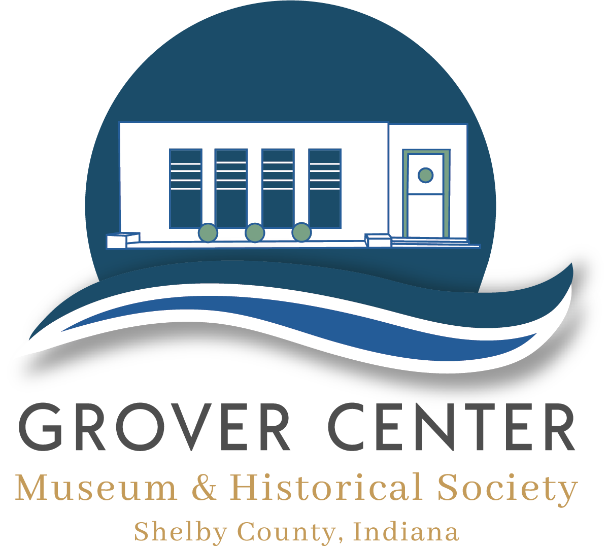
The New Master Logo
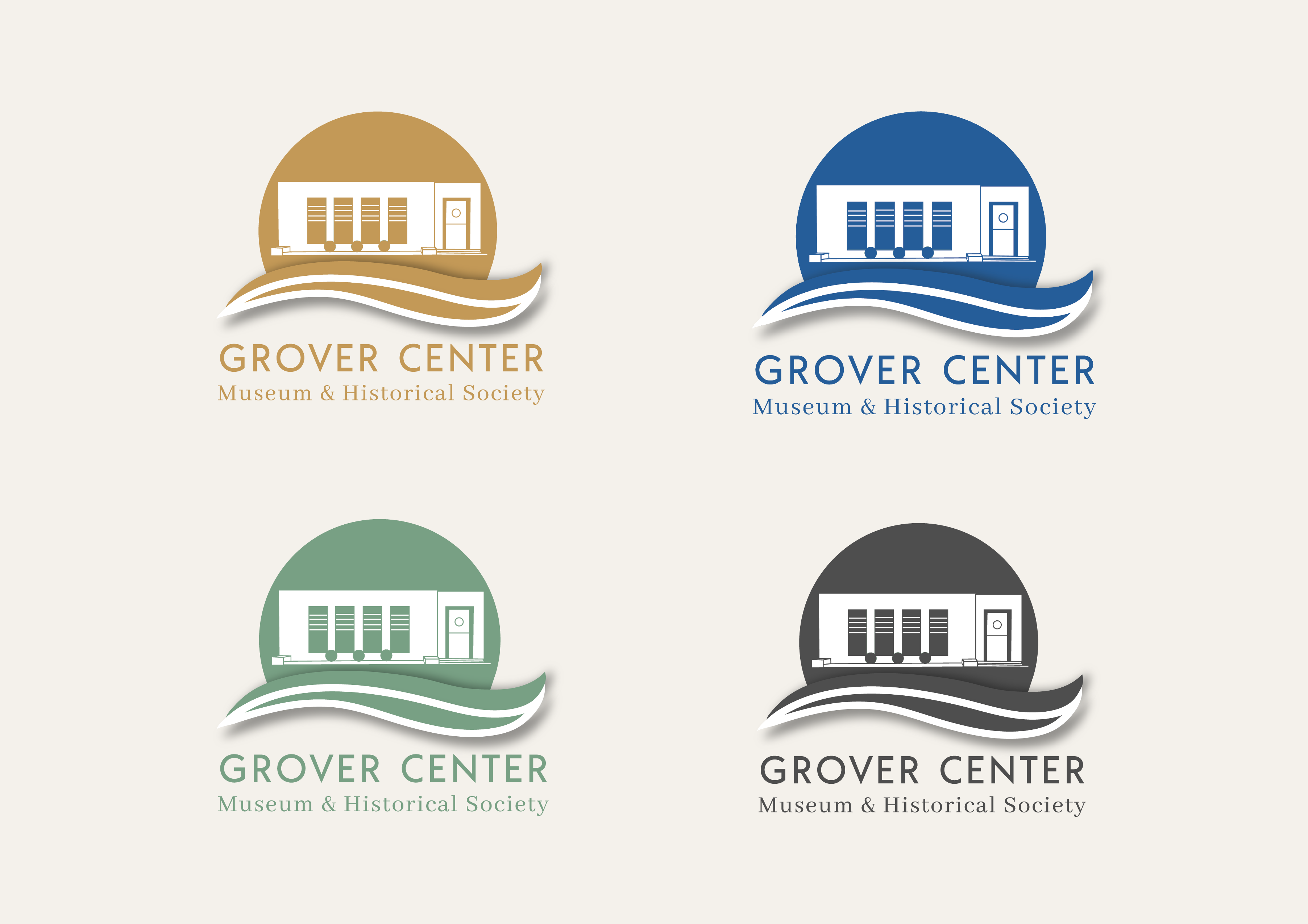
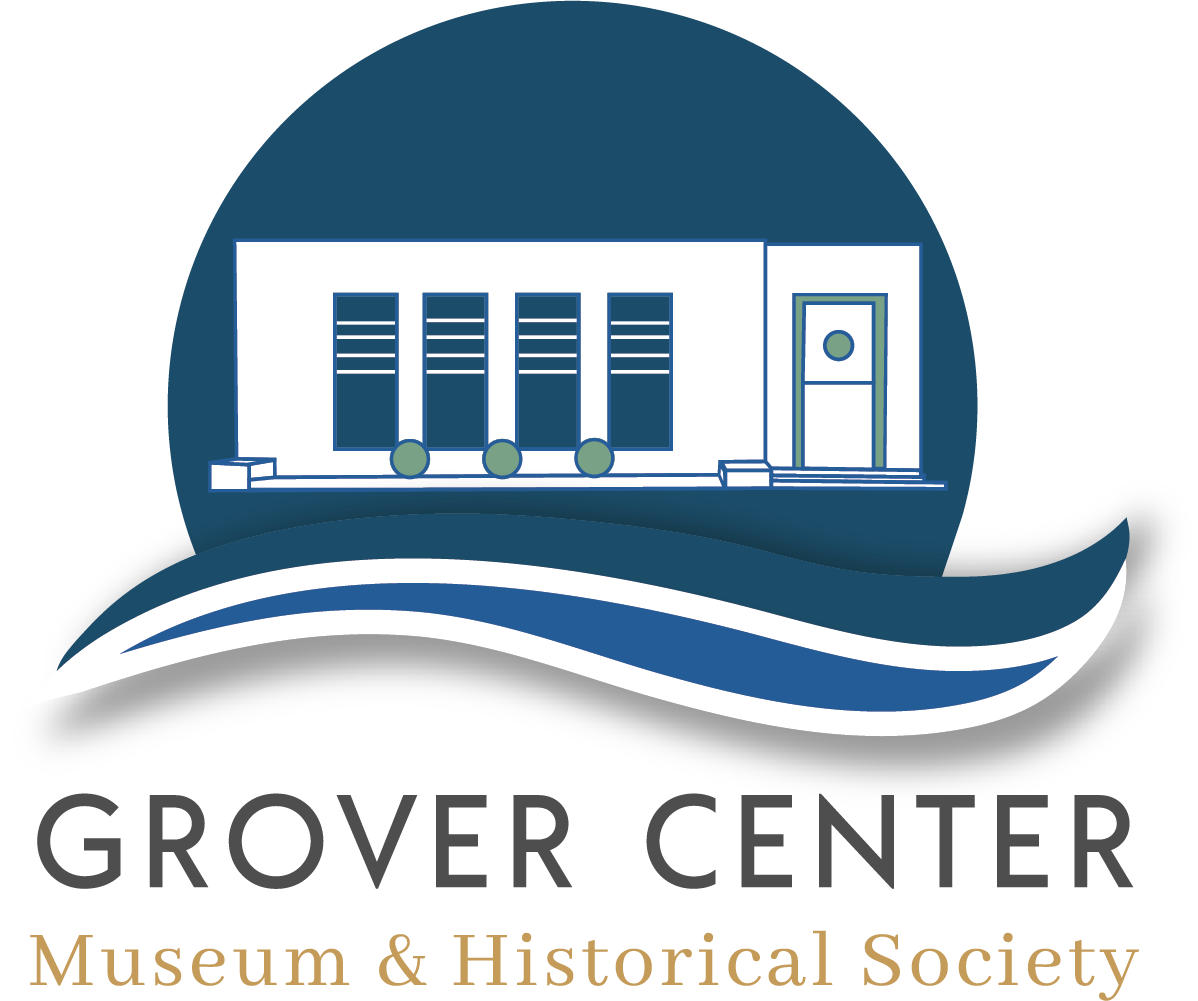
The mark combines a classic and modern look into one entity, symbolizing the progression of the organization and the history it represents. The building was put front and center as the core of the brand. The Big Blue River runs through the county, and due to its importance in the city, it was incorporated into the mark as two swishes below the building. The placement within a circle has dual meaning: “The Circle” is an iconic landmark in the town of Shelbyville where the organization is based, and it’s meant to also show the potential and creative energy of Grover.
Alternative Logo
An alternative version of the master logo is always recommended to allow for versatility.
The Colors
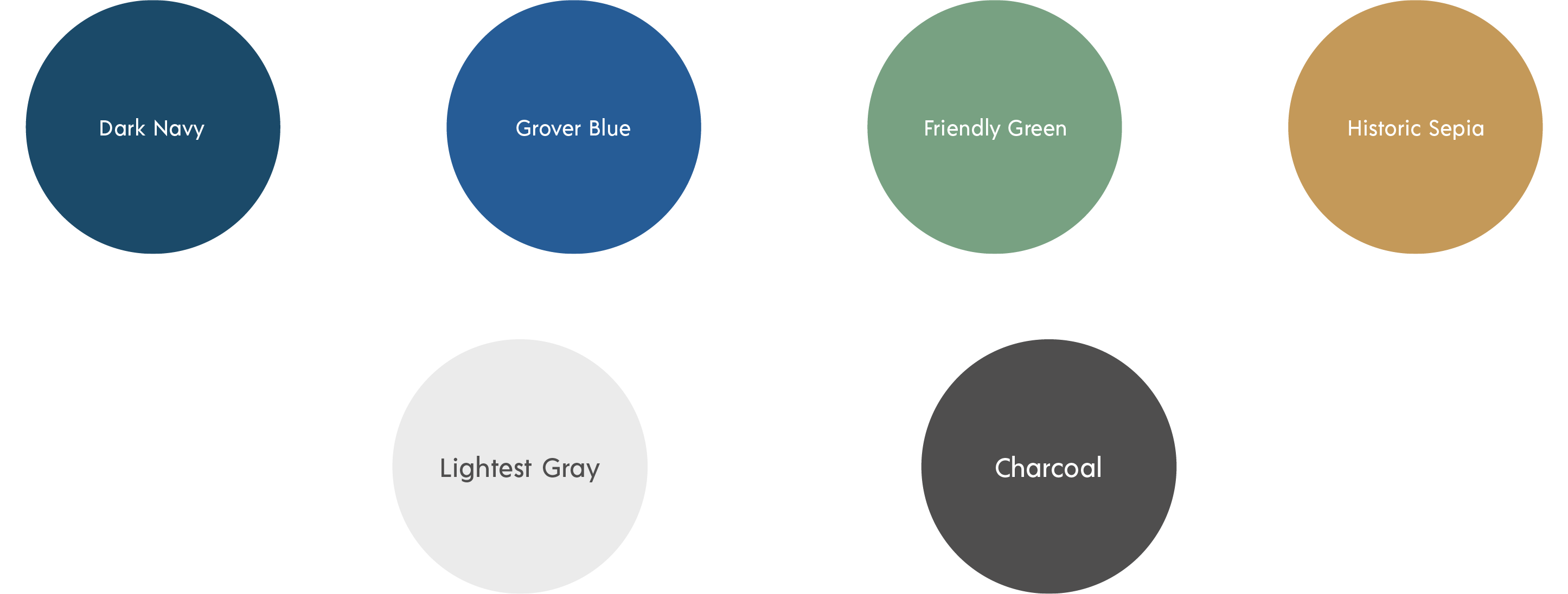
The colors chosen convey the professionalism, authenticity, and trust of the brand.

Brand Asssets
Rounded edges and shapes are used to not only evoke the friendliness of Grover but also be representative of the flow of the river. Icons such as hands shaking to show community were also included in the brand visuals. These graphics are easily incorporated into marketing materials and social graphics.
Want to see more? Glad to hear it!
You might also like:
Branding & Design
Project features: Branding, print and layout, web design
Branding & Web Design
Project features: Branding, print and layout, web design
Web Design
Project features: Web design, print and layout

