
Branding & Design
Kuzneski Insurance Group
")
The Brief:
Although highly referral-based, Kuzneski Insurance Group was looking to expand their markets and opportunities as well as give their brand a new face. They wanted to stand out in a crowd, show how they’re process-oriented, and bring some personality to an industry that is otherwise seemingly monotonous.
Scope of work:
- Company rebrand
- Messaging and brand strategy
- Illustration
- Marketing collateral
- Social media templates
- Iconography
- Art direction of website
Before
The logo was a standard wordmark but started to feel cold and distant from the company values. Not to mention, it resembled many others in the field of insurance and lacked personality. There were no brand guidelines and marketing collateral all varied from one another. Additionally, a gradient that was to be used as a backdrop with the brand visuals did not translate well when printed, thus limiting its use. They wanted an overhaul that represented them and could be included in their process.
After
Honeycombs symbolize structure and are often associated with intelligence. Hexagons also represent communication, integration, dependability, and balance. I wanted to show this side of Kuzneski with this design while color and a thick san serif font bring some fun to the look. Seven hexagons were specifically included in varying colors to represent their core services with the negative space of a missing hexagon to symbolize the client /partner/employee as the piece of the puzzle that completes them.

The New Look
Kuzneski Insurance Group’s new look is fun, inviting yet still maintains their professional side.
Two-dimensional illustrations, icons, and geometric shapes were all included in the identity to add visual interest to the brand.
Alternative Logo
An alternative version of the master logo is always recommended to allow for versatility. Along with one color and wordmark versions, a circular stamp was made for uses such as limited spacing, social media, and more.
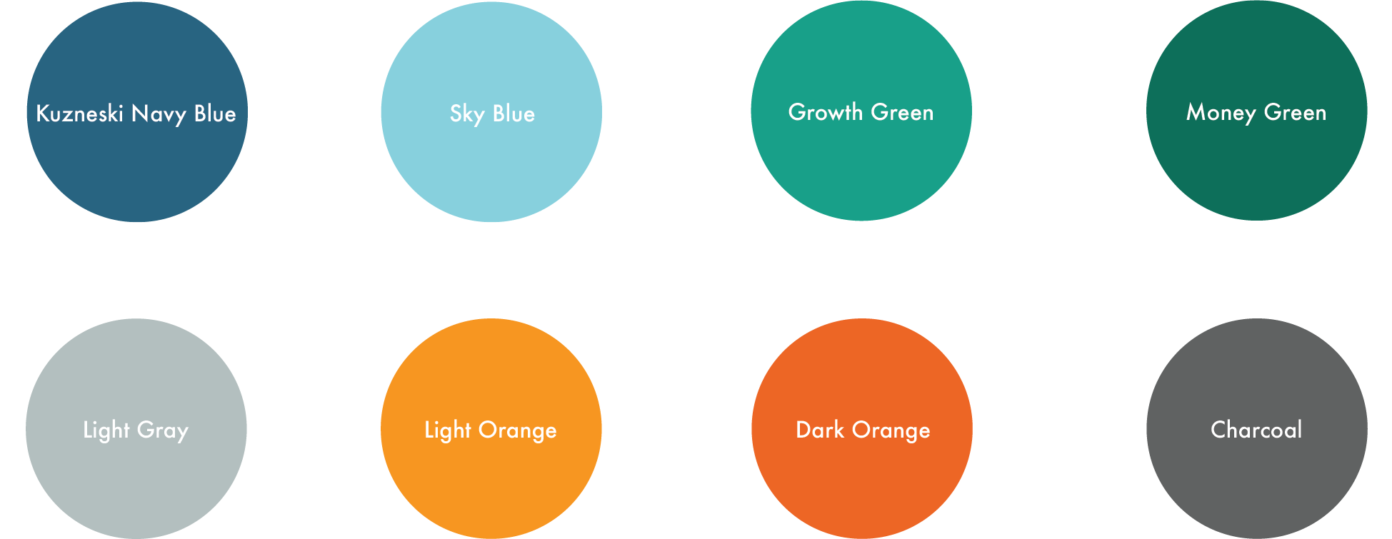
The Colors
The color palette helps to define the brand and was designed to be fresh, friendly, modern and distinctive.
Company Icons
A custom icon suite was created to communicate the services and processes of KIG and can be used across multiple marketing channels, including and especially the website.

Creativity Means Business
With a library of design templates and assets (along with a manual of the company identity), KIG can combine efficient messaging and creativity to communicate their services and values, which in turn attracts not only their target audience but also target employees as well.


Want to see more? Glad to hear it!
You might also like:
Branding & Web Design
Project features: Branding, print and layout, web design
Branding & Web Design
Project features: Branding, print and layout, web design
Web Design
Project features: Web design, print and layout