

Branding + Brand Management
Shannon Sottile
Helping a financial advisor develop her own brand and gain clarity so that she can effectively market her business
")
The Brief:
Initially promoted under a community of financial advisors when she first left corporate to practice on her own, Shannon was in need of her own brand to help her become known. She also needed a website to attract her target audience and promote her niche in agribusiness.
Scope of work:
- Discovery and strategy
- Logo design
- Marketing collateral
- Messaging
- Type and color
- Website art direction
- Brand management
The Master Logo
Shannon wanted to make sure the brand did not feel sterile and wanted to exude warmth, nature, a comfortable atmosphere, and her approachability. Creating a diamond shape to represent wealth and finances, the logo is reminiscent of the Olympic torch (with leaves representing growth), passing knowledge from one person to the next.
Defining the Brand
The visuals were not the only piece of the brand to include an organic feel. Incorporating nature imagery and natural terms with her brand, a simple and straightforward tagline was developed: Plan | Invest | Flourish
The messaging also defied the typical financial firm, consisting of a tone of voice that is friendly, down-to-earth and casual. There is no use of jargon, and industry terminology is broken down into digestible conversational style content.

Alternative Logo
An alternative version of the master logo is always recommended to allow for versatility.

The Colors
Earth tone colors were implemented to show Shannon’s organic approach to wealth planning as well as her knowledge in agribusiness.
Company Icons
Custom branded icons were created to represent different sservices on the website. Icons designed by Charlotte Levinson.

The Website
The development of the brand removed a huge weight off Shannon’s shoulders: the website. Prior to having a strategy or visuals in place, she was unsure where to begin in both copy and layout. Following the launch of the brand, we were able to tackle this challenge together.
Limited in the platforms she could use due to compliance regulations, we included customizations to a pre-made template to show Shannon’s personality and expertise as much as possible while expanding her reach into new markets.
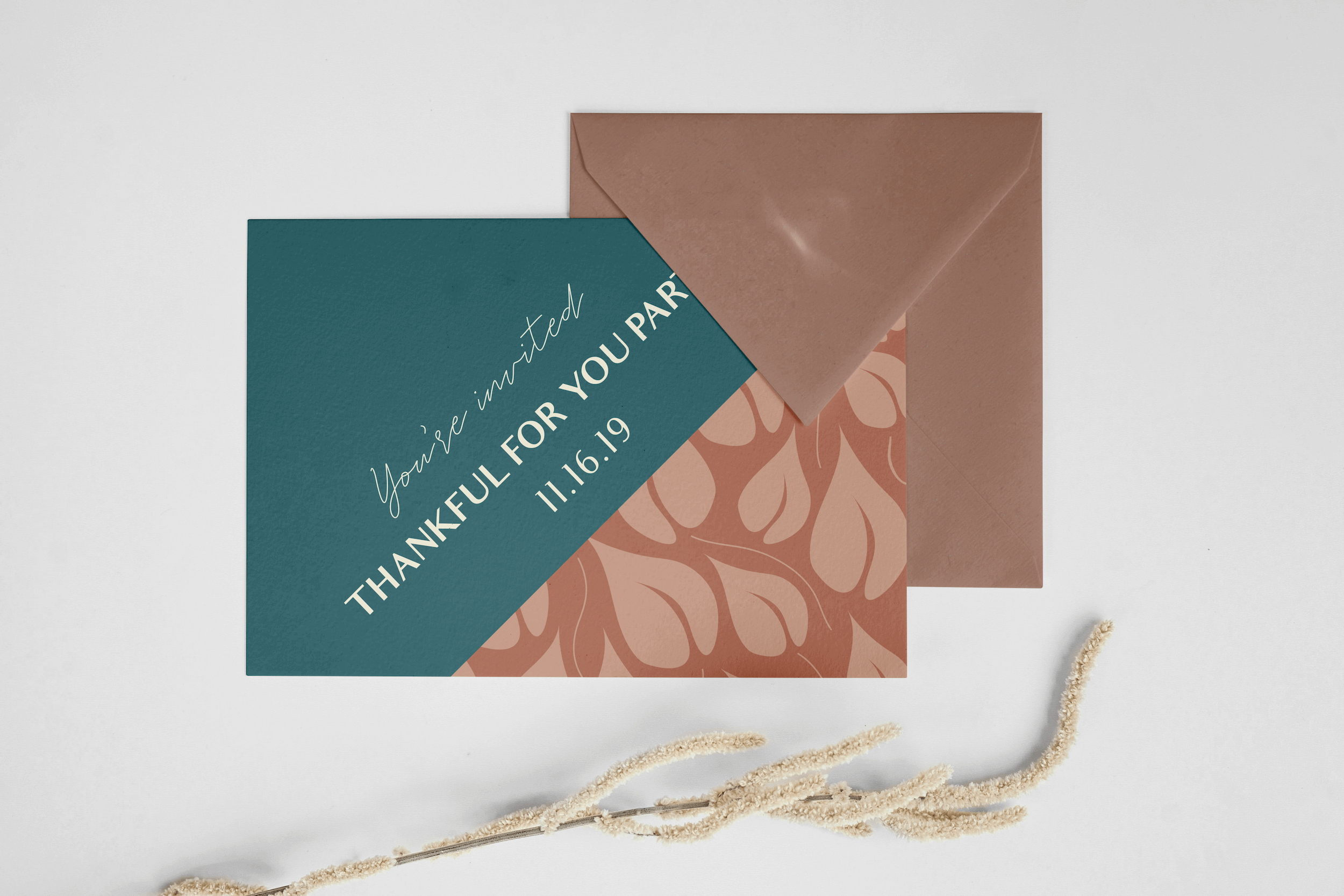
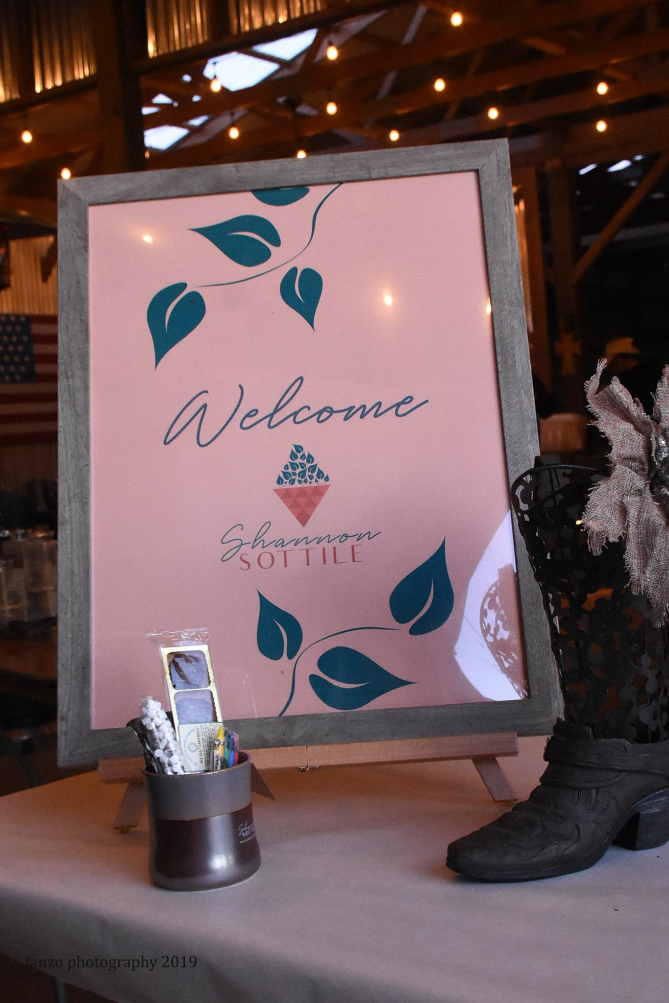
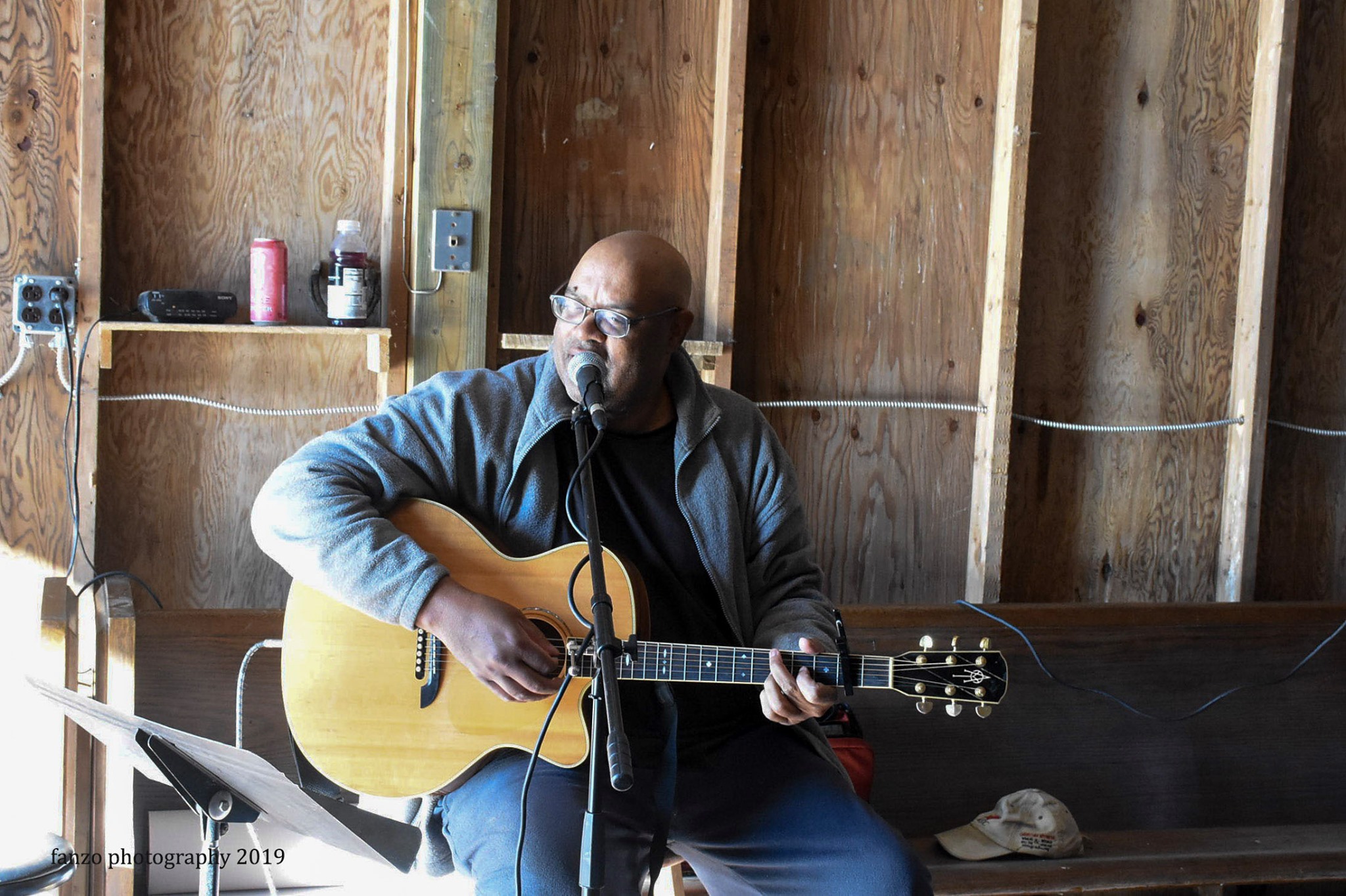
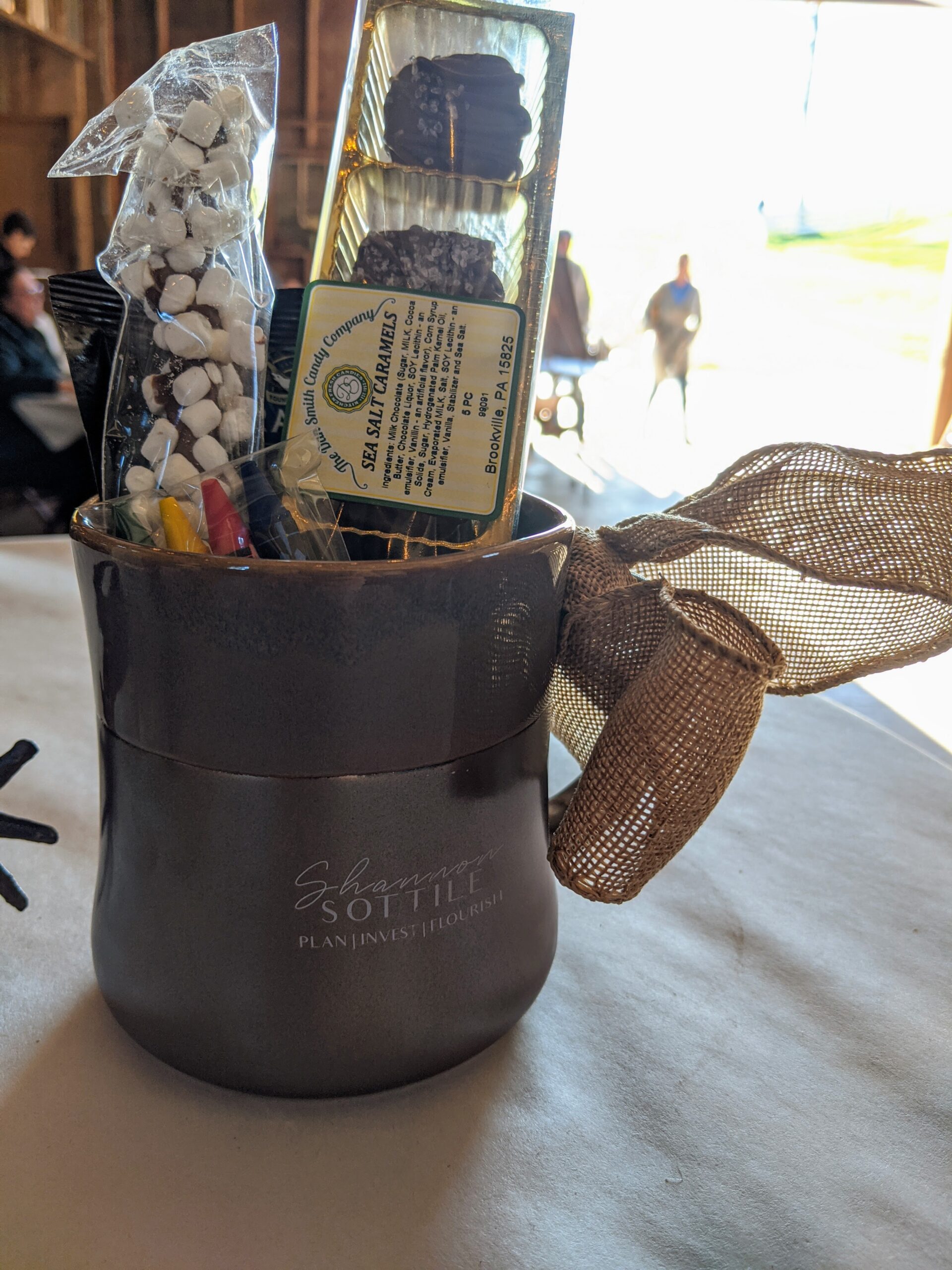
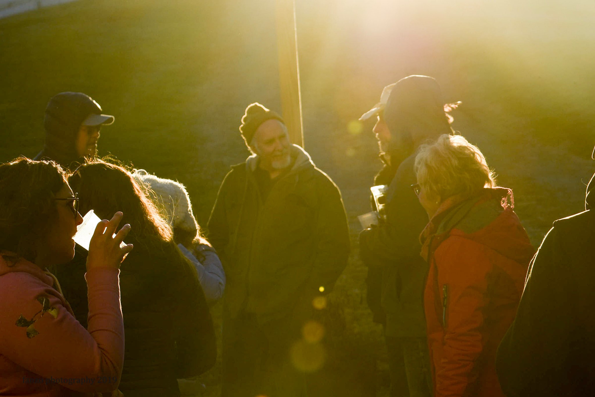
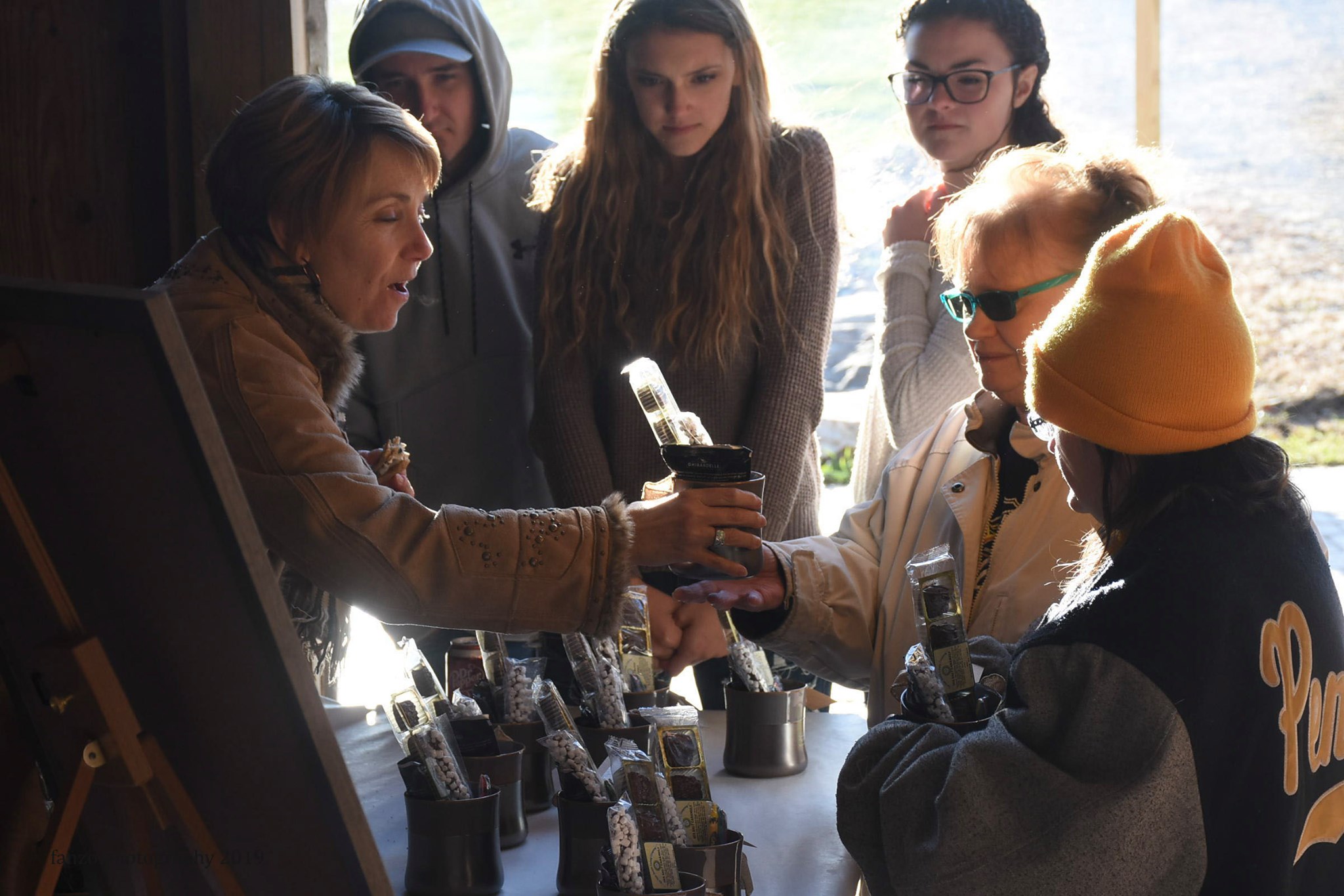
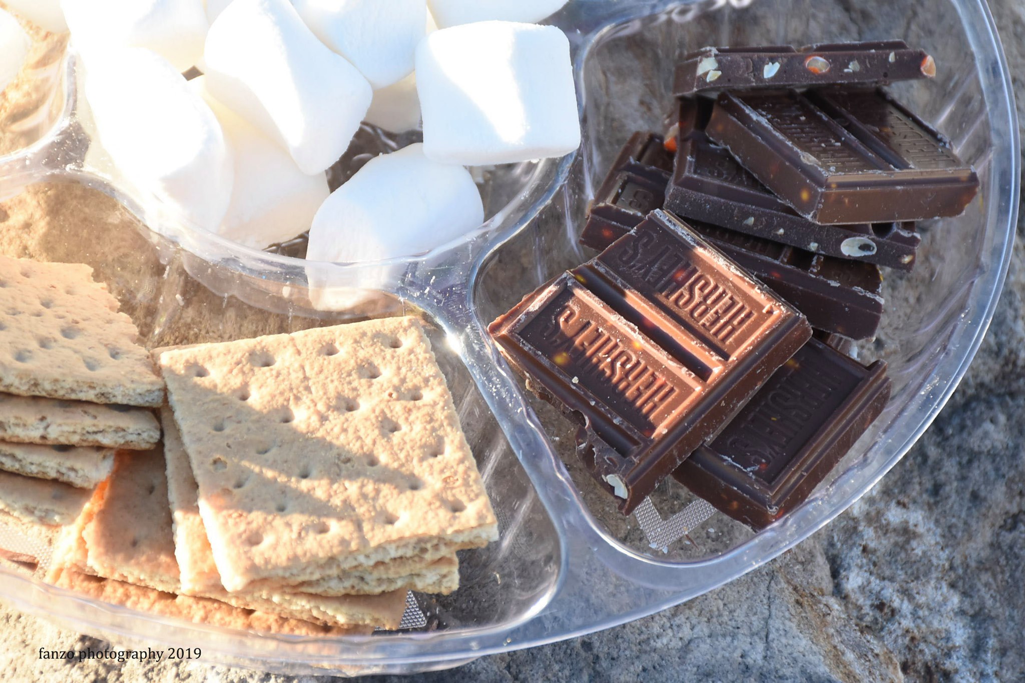
The Launch Party
To generate buzz and celebrate the new brand, a lanch party was planned inviting existing clients and contacts. The party consisted of family-friendly activities, including hay rides, a bon fire with a s’mores bar, live music and more. We teamed up with local businesses to be a part of the event, from hiring a local caterer to beer tastings to using a local printer to print the invites and signage. Working with independent businesses and giving back to the community are two important aspects of Shannon’s brand, and we wanted to embody that in the launch.


This project has been featured on The Best Professional Services Print Designs by Design Rush. See it here.
Want to see more? Glad to hear it!
You might also like:
Web Design
Project features: Web design, print and layout
Branding & Web Design
Project features: Branding, print and layout, web design
Branding & Web Design
Project features: Branding, print and layout, web design