JC Design & Media:
The Brand Story
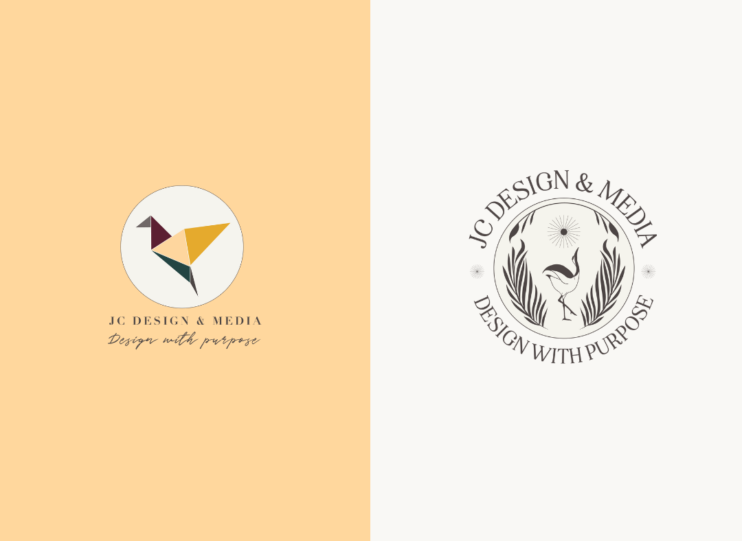
After four years in business, I realized my visuals needed an upgrade in order to align more with the style of work I do. As time went on after my first refresh in 2020, I felt a disconnect from my own story and my company mark.
It’s important to me that the brands I create are as unique as possible to the companies owning them; that their story is embedded within the visuals and message. I noticed my own company story was not protrayed as much as I would like it to be, which led to a deep dive into the ways my business has evolved.

While the origami bird was relevant to my brand story, it did not feel unique enough to what we do.
The meaning behind my logo always paid homage to my parents, who always believed in me and encouraged me to follow my talents. The crane and Japanese elements honors my mother, who is half Japanese, and JC is a nod to my father, who always called me JC. But, it was time to take my mark one step further and make it even more unique to me. Thus, the dancing crane came to be.
I knew the crane had to stay, but now it is in the shape of a J and was inspired by cranes dancing in the water. This symbolizes good luck, longevity, beauty, perseverance, and happiness. Organic elements surround the crane to represent sustainability as well as the holistic approach we take with branding and design. The inclusion of ferns was done so specifically because of their dreamy appearance, not to mention they indicate a timeless wisdom, sincerity and magic. Finally, the sun embodies a burst of creativity while drawing a focal point to the contents of the icon.
The Company Mark
I knew the crane had to stay, but now it is in the shape of a J and was inspired by cranes dancing in the water. This symbolizes good luck, longevity, beauty, perseverance, and happiness. Organic elements surround the crane to represent sustainability as well as the holistic approach we take with branding and design. The inclusion of ferns was done so specifically because of their dreamy appearance, not to mention they indicate a timeless wisdom, sincerity and magic. Finally, the sun embodies a burst of creativity while drawing a focal point to the contents of the icon.
The Colors
The colors chosen for the JCDM identity convey certain emotions and have an underlying meaning to the brand. The use of warm, earthy tones is not only used to show the brand’s approachable demeanor, but it also honors my Japanese roots. Additionally, the d ynamic jewel tones provide a sense of distinction.
The palette remains the same as before, as these were still relevant in our brand story. However, tints (the addition of white to a color) were incorporated so that we could have more flexibility in our design system.
Font Pairing
The font families were also updated to align with the updated visuals. A combination of a serif and sans serif help show a nice contrast in copy, but I wanted the brand to still be approachable and not too regal. My serif is charming, inspired by magazine adverts and has a touch of whimsical appeal. My sans serif is sleek and legible, making it great for body copy while being timeless as well.
My process involves combining form and function, and I used this on my own rebrand. The results are something that I am more connected to, provide more versatility, and have been designed to expand with me as I grow this humble dream of mine.
Sometimes your rebrand is only related to your visuals. Other times, it’s because your target has changed or evolved. While I have enhanced my service offerings, my focus for the studio remains the same — working with impact-driven business. But now, my logo tells more of a story than it did before.
This business has taken care of my husband and I through medical school and a pandemic as well as through three different moves. It has seen me through burnout, has fueled my creativity, and has introduced me to some amazing people. I look forward to seeing what’s next for JCD&M, and I hope you’ll follow along with me on this next phase in my journey.
Have you outgrown your brand or need to take it to a new level? Schedule a strategy call to see how I may be able to support you through the process.
You May Also Like:
The Power of a Rebrand: How ADE Aligned Their Identity with Their Mission
The Power of a RebrandHow a Strategic Rebrand Helped Action Driven Education Connect with Their Audience In 2020, I had the opportunity of working with Action Driven Education (ADE) on a rebrand to help them align a visual identity with their powerful mission. ADE...
Breaking Free from Imposter Syndrome
Overcoming Imposter Syndrome in Your BusinessImposter syndrome is a common struggle for many professionals, including brand designers and small business owners. Whether you’re a seasoned expert or just starting out, feeling like you’re not good enough can impact your...
Social Media Strategies for Small Businesses: How to Make a Big Impact
Amplify Your Brand's PresenceUtilizing social media to be intentional in telling your brand's storyIn today's world, social media has become an essential tool, if not a necessity, for small businesses looking to make a significant impact with limited resources. At JC...


